So, style, to help me get an idea of how I would like my environment to look I have been researching online and in a few books. I would like something with a nice soft, smooth feel, and isn't to crazy on patterns and colour. Just a nice clean look.
These are a few pictures I found from Studio AKA. They have a nice soft atmosphere and are nice and simple. I know I wont be able to get mine to look exactly like this, because I don't have renderman or a year to wait while it renders. But I'm gonna try and find away around this so I can get it close enough to what I'm after. 

(Oliatum - Mitzy, H Samuel - Mr Sparkle, Varmints, Lloyds TSB - Shower & Campaign, http://www.studioaka.co.uk/)
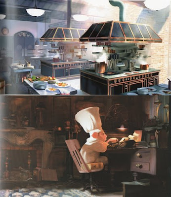
I also found some images in the Art of Ratatouille book. Here are just two of the ones I liked in the book. I like the way the soft light falls on to the surfaces. This is the sort of light I would like to use; soft and misty, because I think it will look nice in my set.
I also found some images in the Art of Ratatouille book. Here are just two of the ones I liked in the book. I like the way the soft light falls on to the surfaces. This is the sort of light I would like to use; soft and misty, because I think it will look nice in my set.
(Art of Ratatouille by Karen Paik and John Lasseter)
friend told me about this website that they used to love when they were younger which had some nice artwork by Cameron Tiede, and might be similar to what I am after with my set. So I took a look and found some very nice artwork, its very stylized, colourful and playful. I really like the way he uses colours, its all been shaded together with low lights and highlights, and is very similar to how I like to colour. 

The images from Studio AKA and Ratatouille are very different from that of Cameron Tiede, and I would like to try and combine these, using the colour from the paintings and the light and atmosphere of the CGI images.

No comments:
Post a Comment