Thursday 27 November 2008

Re-Style??

One fine night as I was working on my concepts, an idea popped into my head. It was to make the set look as if it had been done in pencil, crayon or pastel. I spoke to my lecturer Sean to see what he thought and he liked the idea and thinks it could work well. So I took one of the concepts I had done into Photoshop to play around with the effects.

The first one is far to grey, but this was the most colour I could get using the pencil effect. Though I do like the cross-hatching of the pencil, but there is not enough of it.


The second one this time is far to black. Though it does show up the colour so much better. However, I don't think I will use the pencil effect.


On this picture I used the pastel effect and it works so much better. It keeps all of the colour and is closer to what I am after.
Though I think it would be a good idea to see if the After Effects software also has this effect (or something similar) to speed up the post production.

Tuesday 25 November 2008

Im still here!!

I thought it was about time I did an update as it has been a little while since I posted anything on my blog. I haven't been doing nothing all this time, I have in fact been messing around with concepts, thinking of ideas, sorting out an animatic, messing around on Maya and working on my dissertation. Which, you will be happy to know, will be appearing on my blog asap!!!
The concepts are taking so much longer then I expected so I am hoping to get them finished and out of the way so I can get on with the actual modeling.
So keep an eye out as there will be many more blogs to come!

Saturday 15 November 2008

Cha cha cha channnngeessss!!!

After a meeting I had with my lecturer, Sean, I have decided to change my idea a little bit. Instead of using floor plan 1, I will now be using floor plan 2 instead. Iv changed it because it will be better for me to get my idea across to the audience, so it will be less like a show real and more of a film piece to help keep the ward a secret from the audience. Also, I have decided to make it christmas on the ward.

So, To help me keep track of what I need to model for the ward I thought it would be a good idea to make a list.

Main bed area...

  • Fairy lights

  • Bed

  • Teddy

  • Bed light

  • Kids pictures on the wall

  • Cup

  • Water jug

  • Fruit bowl

  • Christmas cards

  • Cardboard Christmas tree

  • Decorations hanging from lamp

  • Canvas pictures

  • Bedside table (with draws)

  • Drip

  • File on end of bed

  • Bed table

  • Nurses button

  • Electric socket

  • Hand cream

  • Curtain

  • Bandages

  • Tissues

  • Blind

  • Books

  • Balloons

  • Oxygen mask

    Play area

  • Rocking horse

  • Shelving unit

  • TV

  • Rug

  • Tables

  • Chairs

  • Paper

  • Pencil pots

  • Pencils

  • Keyboard

  • Books

  • Non-slip Matt

  • Soft toys

  • Dolls house

    Nurses desk….

  • Computer

  • Chair

  • Hand wash

  • Notice board

  • Book shelve

  • Lamps

  • Fairy lights

  • Pens

  • Pen pot

  • Clock

  • Lights board (for when patents call for nurses)

  • Thank you cards

  • Posters

  • Kids drawings

  • Folder holder

  • Stethoscope

  • Cup


    Rest of the ward

  • Strip lights

  • Curtains

  • Kids car

  • Beds

  • Curtain rails

  • Metal shelve unit

  • Bandages

  • TVs

  • Bed side table

  • Exit sign

  • Emergency exit signs

  • Wheel chair

  • Chairs by nurses desk (small waiting area)

  • Air vents

  • Fire alarm

  • Fire extinguishers

Tuesday 11 November 2008

A few concepts to start with....

The first concept I produced was a rocking horse in the children's play area (I wanted to get an idea how my objects would look, so i started small). I like the shading but I'm not keen on the black outlines or the colour of the floor. Though I do like everything else in the picture. I have placed the soap dispenser (which is extremely common in hospitals as a matter of general hygiene) on the wall by the exit so people can wash there hands as they enter and leave the room.


Next is a teddy for the private bedroom. I really like this picture, but again I'm not sure on the dark black out line, so on my next drawing I will take out the black line and either leave it all together or use the colour of the objects. I like the style of the picture and am happy with the colours I have used.


Here we have a concept of the bed area. I left out the black lines and think it looks so much nicer. I want it to look really colourful so have used lots of colours but keeping them with in the limits of a hospital, using lots of pale colours with splashes of bright yellows, reds and greens. Also for the cards on the shelve I will change the get well soon to either happy birthday or merry christmas, because it will give it away that the child could be in a hospital.


Then I did a concept of the whole bed, its still in keeping with the other concepts and is beginning to look like its in a hospital, just with the drip and the bed, (this sort of shot wont be shown until later on in the film). I chose to do the bed like this because I found a picture in the news about Great Ormond Street Hospital and these are the beds they have. They fit in so much nicer then a normal beige hospital bed would. This is one of my favourite concepts.


Then we have a view on the nurses desk. I want the desk to be in darkness to begin with, I found this quite hard to colour because I didn't want it to be pitch black, but it has come across a bit muddy.


Coming outside of the room, now in the main ward, we have the nurses desk with a mural painted on to the front. Some of the objects are a tiny bit out of perspective, but it still gets my idea across. I like the curtains which surround the beds, but I will make the desk a little more messy so it looks like its been used.


Finally, we have the playroom. I like the walls of the room and think it looks a little more used then the nurses desk because I tried to make it more messy as a playroom would be.

Group work...

To be able to get some really good photographs of the inside of a hospital I thought it would be much easier to take a visit rather then just getting them online. As Jo's mum is a Nurse at a hospital, Jo offered to go there one day to take some photos for me. She got me a lot of really good photos which will come in handy for my set, as well as a few videos.

A mini mood board & colour swatch...

My mood board is quite colourful, and has a few of my little concepts in it (the bear, rocking horse, and the lion). I've noticed that there's a few greens and blues in it, which is similar to what some hospitals would have. Also I have added in a few bits and bobs of hospital equipment, which I will have placed around the area.
Further more, most hospitals, I have found seem to have a mural of some sort on the wall of the child's play area and nurses desk. Which is where I will place the lion.


From the mood board I have come up with some colour swatches, which contain allot of blues and greens. As well as a few pastel colours. My colours may change slightly over time, but I will keep as close to my swatch as possible.

Style time....

I've returned to add some more work as I think I have left it a tiny bit long as I've been distracted by concept work.

So, style, to help me get an idea of how I would like my environment to look I have been researching online and in a few books. I would like something with a nice soft, smooth feel, and isn't to crazy on patterns and colour. Just a nice clean look.
These are a few pictures I found from Studio AKA. They have a nice soft atmosphere and are nice and simple. I know I wont be able to get mine to look exactly like this, because I don't have renderman or a year to wait while it renders. But I'm gonna try and find away around this so I can get it close enough to what I'm after.


(Oliatum - Mitzy, H Samuel - Mr Sparkle, Varmints, Lloyds TSB - Shower & Campaign, http://www.studioaka.co.uk/)

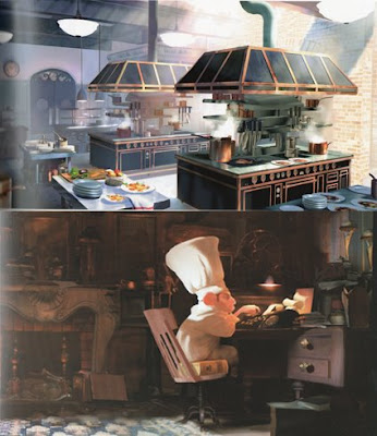
I also found some images in the Art of Ratatouille book. Here are just two of the ones I liked in the book. I like the way the soft light falls on to the surfaces. This is the sort of light I would like to use; soft and misty, because I think it will look nice in my set.


(Art of Ratatouille by Karen Paik and John Lasseter)
friend told me about this website that they used to love when they were younger which had some nice artwork by Cameron Tiede, and might be similar to what I am after with my set. So I took a look and found some very nice artwork, its very stylized, colourful and playful. I really like the way he uses colours, its all been shaded together with low lights and highlights, and is very similar to how I like to colour.
The images from Studio AKA and Ratatouille are very different from that of Cameron Tiede, and I would like to try and combine these, using the colour from the paintings and the light and atmosphere of the CGI images.